Usability issues with Google Wallet's new card design
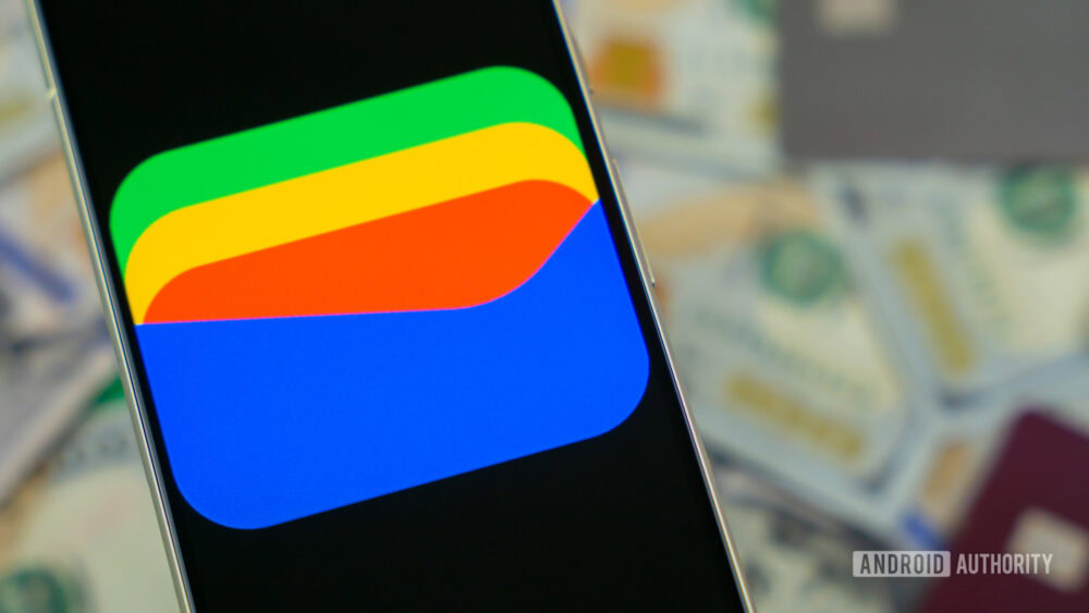
Google Wallet's redesign has faced criticism for usability issues. Users are frustrated by the lack of identification between similar cards.
Google Wallet has started rolling out a new stacked card design that, while visually appealing, has sparked complaints among its users. The main criticism revolves around the fact that multiple cards from the same bank appear identical, as the new stacked view does not display identifying details like the last four digits of each card.
This situation becomes particularly problematic for those managing multiple cards from the same issuer, as confusion can lead to errors during payment. Furthermore, many users have noticed that switching between their most-used cards has become more tedious compared to the previous horizontal carousel.
## Why it matters This redesign could impact user experience at a time when ease of use is crucial for payment applications. Usability is key to the adoption of financial technologies, and issues like these may discourage users from utilizing the app regularly.
## What we know The new design of Google Wallet is being rolled out to more users, which has allowed these criticisms to become more visible. The company has yet to provide a formal solution or response to the concerns raised by users.
## What is still unclear It has not been confirmed whether Google plans to make adjustments to the Wallet interface to address these complaints. Users are hoping for an update that enhances card identification and facilitates switching between them.
Read at the original source:
Android Authority →Related news
 Apps
AppsGoogle Photos adds quick editing feature for videos
The Quick Edits feature is now available for videos in Google Photos. This simplifies the editing process before sharing multimedia content.
 Apps
AppsSpotify launches audiobooks in over 180 markets
Spotify has started offering audiobooks in more than 180 markets, with a wide selection of titles available.
 Apps
AppsGoogle Play developing a gamer taste profile feature
Google Play is creating a game recommendation feature similar to Spotify. The new Gamer DNA profile will use gameplay data and preferences to personalize suggestions.